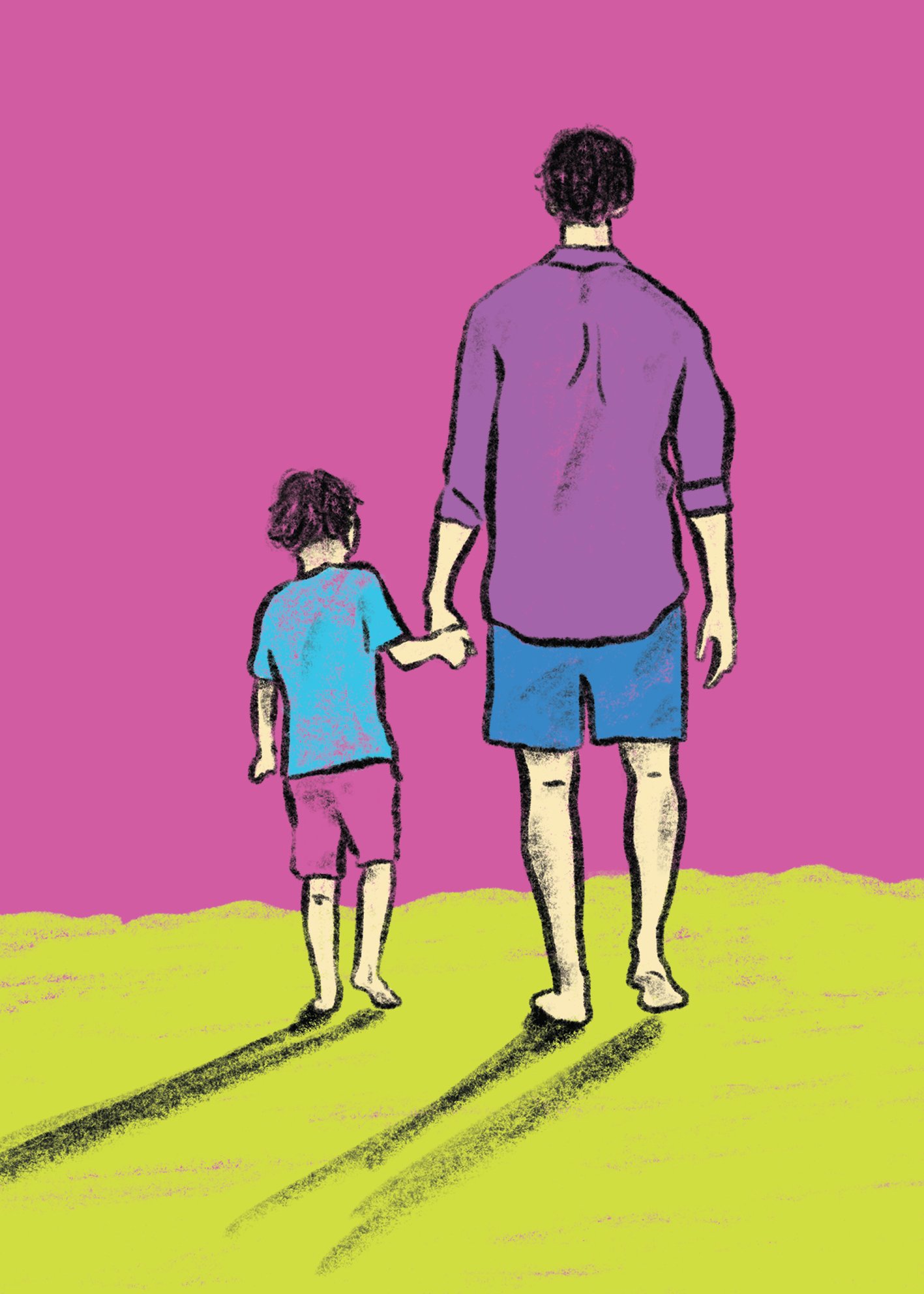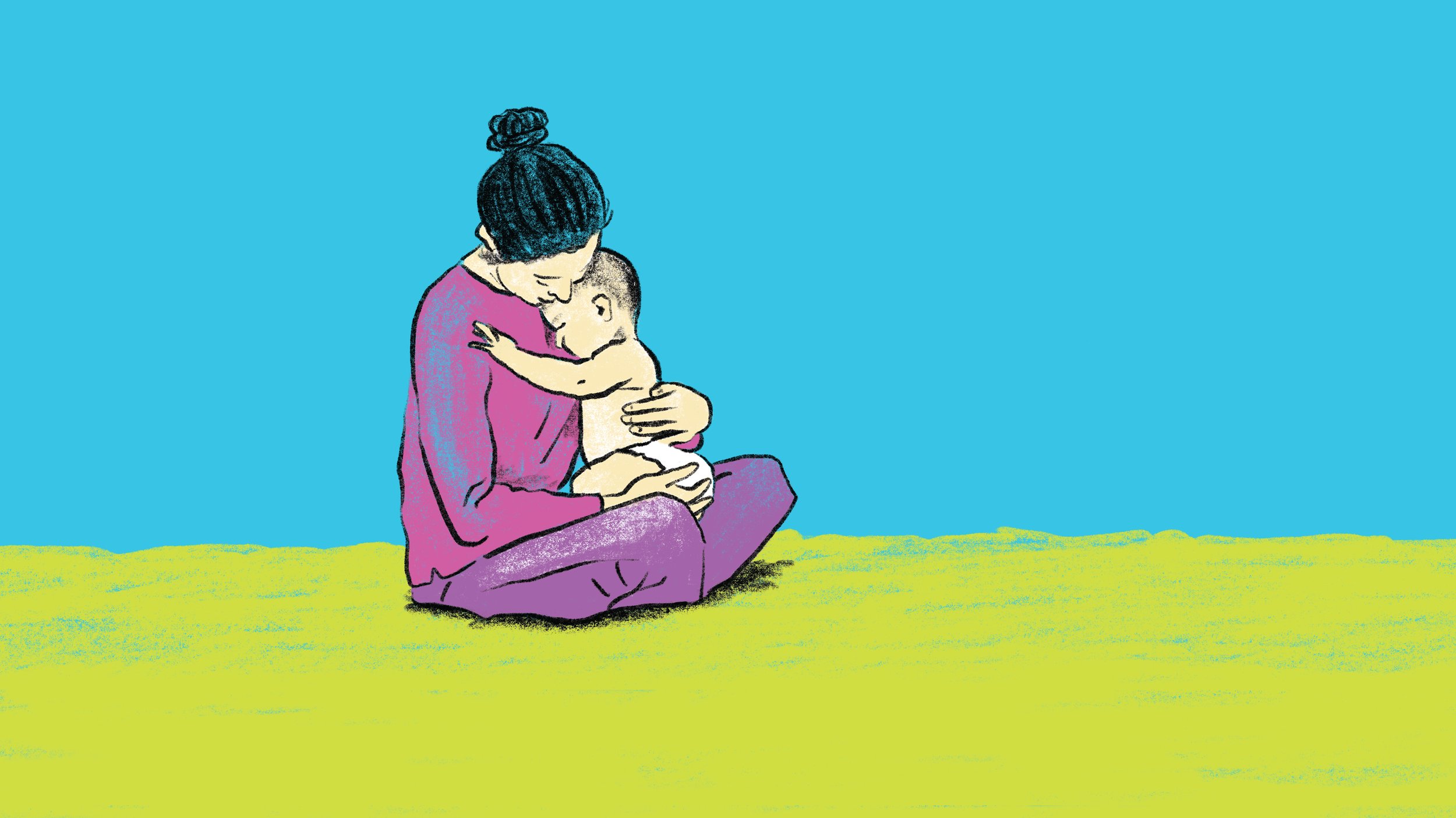
A storybook approach to tell the tale of WellKids
WellKids is a paediatric and family chiropractic and nutrition clinic. Passionate about seeing babies, pregnant mums, children, and families function at their best.
The brand is based on storybooks. Walking people through in an easy to understand, step by step nature. Using illustrations to soften things, big clear text so the information hierarchy is obvious, and appealing to kids and adults alike.
WellKids signature green and enchanting painted mural were the strongest assets they had coming into the brand refresh, the rest grew from there.
By building a design system with recognisable typefaces, a strong colour palette, and family-focused illustration library, WellKids have the tools they need to continue having fun communicating with their clients for years to come.
Learn more about them on their website →