Working with CEDA and Chris Whaiapu, we developed a place brand for Te Utanganui that can grow as the project develops.
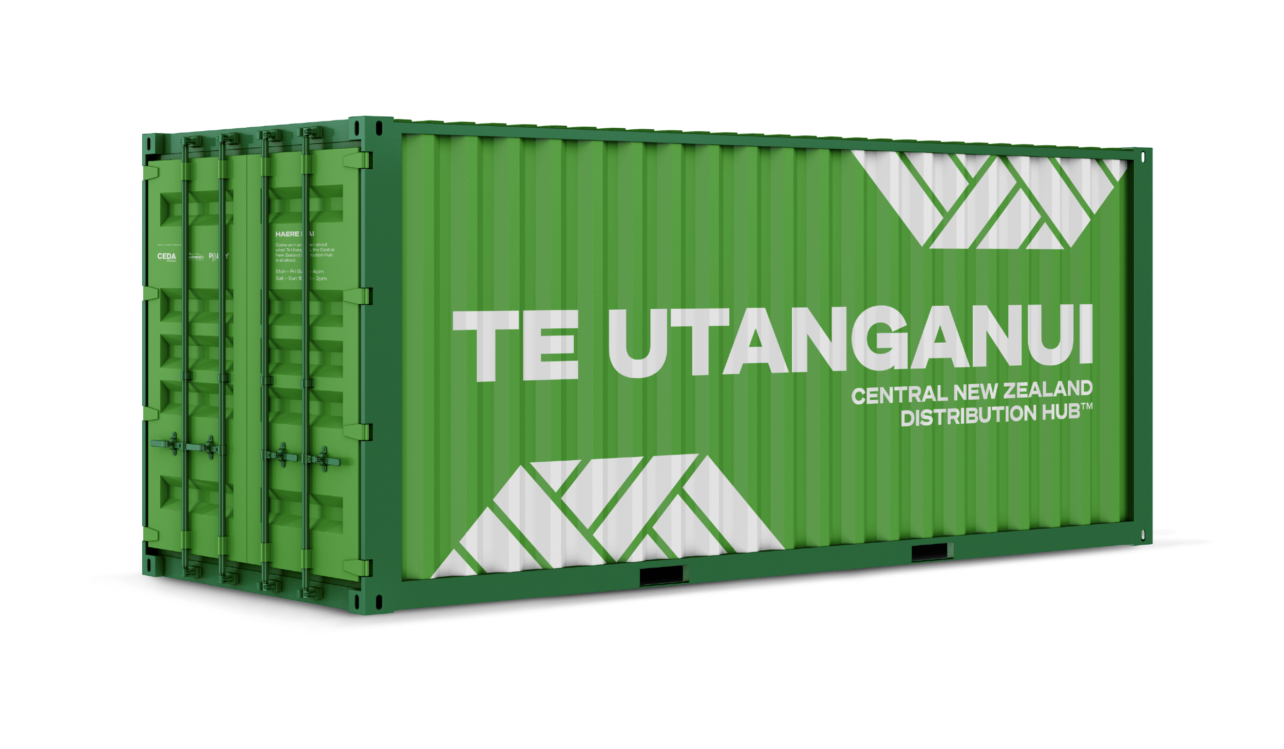
The Central New Zealand Distribution Hub was gifted the name Te Utanganui by Rangitāne o Manawatū in October 2021. The name refers to the concept of an inland port, of transient goods arriving by sea, sky, and land, and then out again – ki tai. It represents the significant role Te Utanganui has in the transport of goods throughout New Zealand and the world.
The name drew inspiration and appreciation from the local geography, of its creeks and streams that carve pathways from the mountains to the sea. Ki uta refers to an inland location, and Nui describes the vastness and importance of the hub.
Ki uta ki tai.
Mountains to sea.
The mana of this name and partnership with Rangitāne o Manawatū is foundational to Te Utanganui.
The three parts of the tohu represent the analogue materiality of Te Utanganui.
The geometric shapes evoke visual metaphors of a food-basket (kete), waka, maunga and pathways through land in an aerial photograph. Streams can be interpreted in the 'negative' space between shapes. Their paths clear in our tohu, then continue on their journey.

Our tohu wraps our name to demonstrate being central. The logotype is based on the typeface Söhne Breit by Klim.


