Tumeke Farming
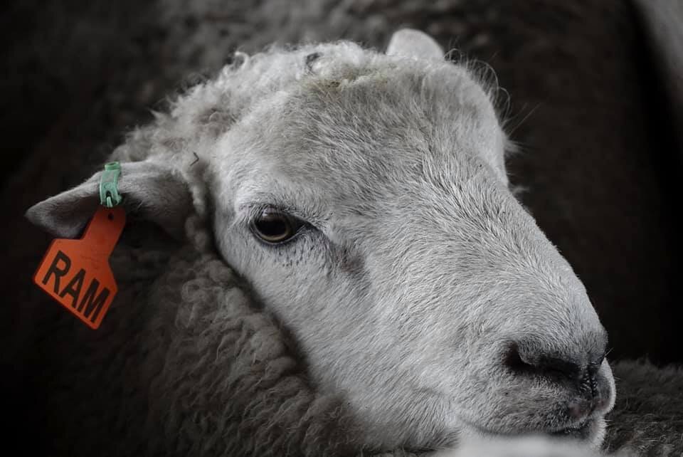
Pascale and Simon had been operating as Carthew Genetics since the 90s. They have a reputation for being the best in the genetics business, with unique ideas and methods. When they showed me around their farms at the beginning of this project, I noticed that instead of numbers on the ear tags of each animal, they all had names.
I was tasked with creating a visual system that could adapt across all print and digital channels, that would be fun and flexible and reflect their values as newly renamed Tumeke Farming.

Icon
The Tumeke Farming icon draws inspiration from the ‘shaka’ hand sign and the face of a black rabbit.
It’s an ambiguous image, allowing the viewer to interpret it as they please. This speaks to the Tumeke Farming philosophy of having some fun while respectfully exploring what it means to be farming in Aotearoa.
The ‘shaka’ hand sign has a variety of meanings across cultures, with central themes of gratitude and solidarity. The Tumeke Farming team often uses the ‘shaka’ hand sign around the farm to communicate their love for what they do and reassurance that it’s all good.
The significance of a black rabbit is personal to Simon of Tumeke Farming, closely associated for him with good luck.
Name
The phrase ‘tumeke’ evokes exactly how the Tumeke Farming team feels when working on the farm and looking after their animals and land.
The phrase is used a lot around the farm, understood to be a positive expression of gratitude and delight.

Logo
The ambiguous icon paired with clean logotype set Söhne Breit creates the Tumeke Farming logo.
The logo exhibits Tumeke Farmings values of balance and harmony.
The bi-line ‘farming’ balances the weight of the icon on the right, giving the logotype the most visual weight. The bi-line can be swapped out for other business chapters in the future.

Colour
The blue is from the original Carthew Genetics brand, allowing a sense of history and prestige to be carried into the Tumeke Farming brand.
The contrast of the light blue onto blue has been evaluated using the WCAG 2.0 guidelines for contrast accessibility.