Putting a face to a name represents connection. Being the face of your business shows integrity and respect.
I met Adam Curry in 2010 when he opened Central Bicycle Studio in Palmerston North. By 2011 I had convinced him to let me make him a logo.
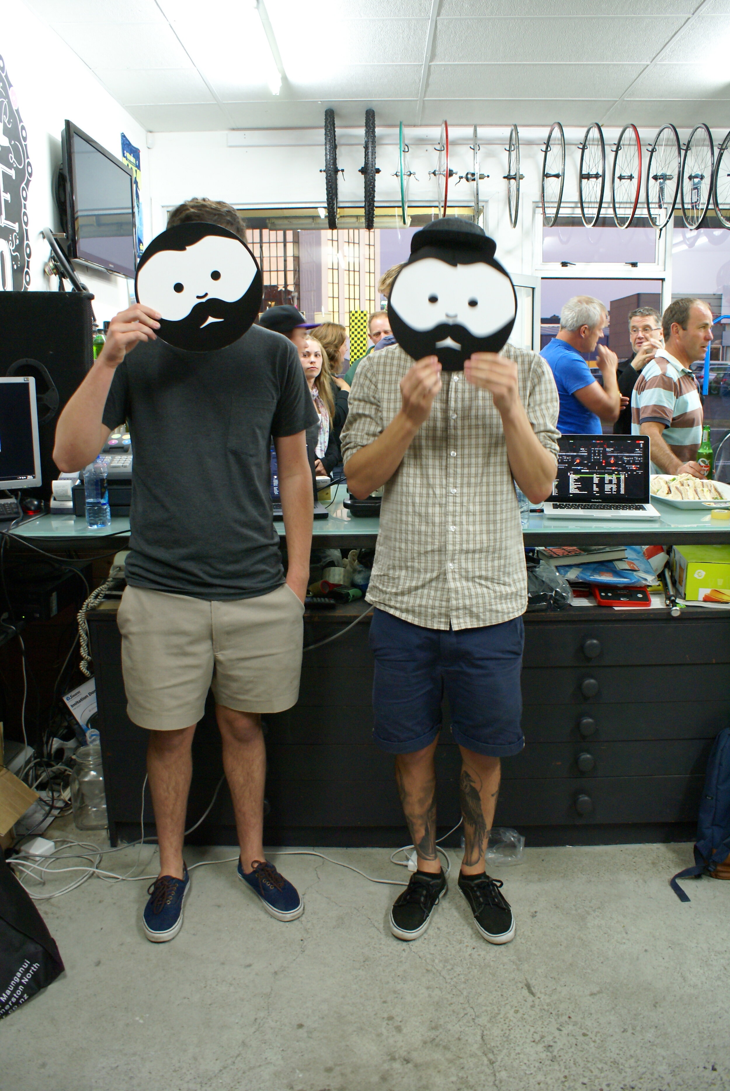
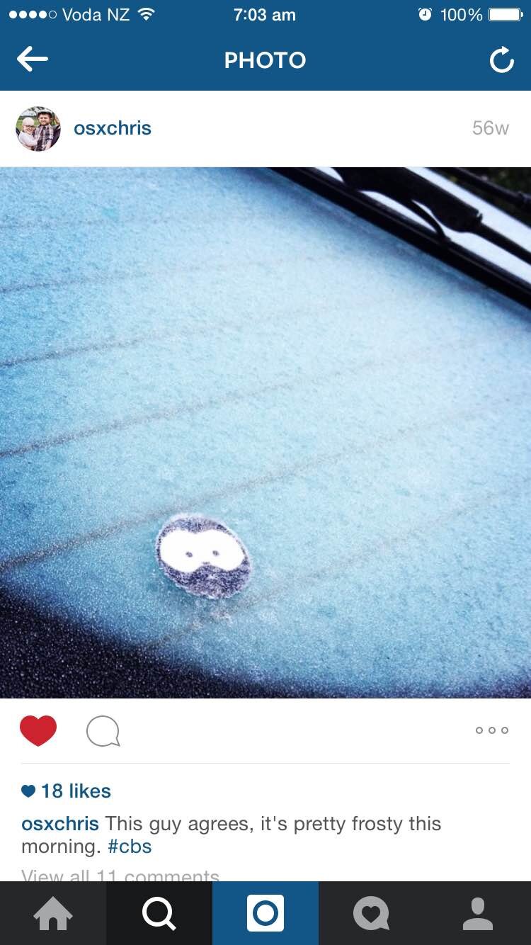
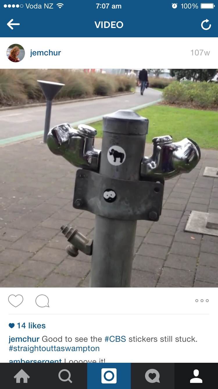
The CBS logo is based on Adam’s face. His head-first approach to business is what he's known for, so using his face as a symbol of this has been very successful. Memorable face, memorable customer experience, memorable logo.
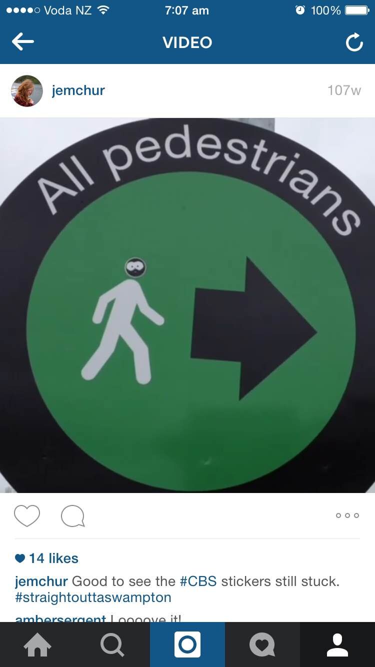
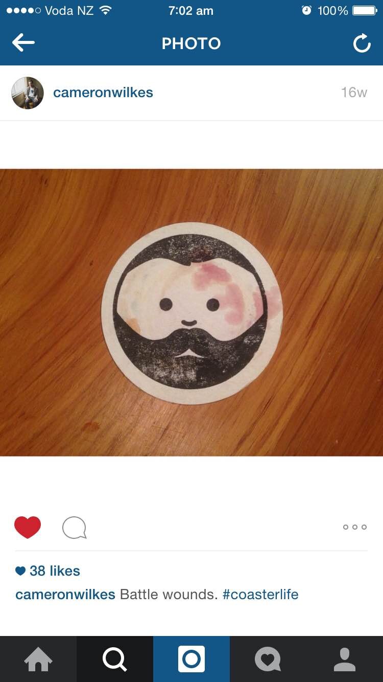
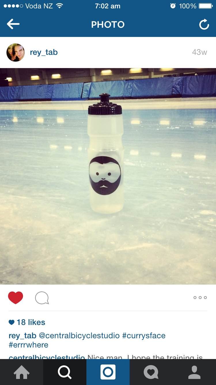
Since 2011 we’ve been putting the face on anything and everything. It has developed a cult following, with some opting to wear the shop’s merchandise despite having any interest in cycling. The logo is a way of communicating the one-man-band ethos that the shop started with. It’s grown in size, reputation, and maturity since then, but the logo lives on.
Central Bicycle Studio


We’ve recently updated the CBS visual system with a new brand typeface, some small adjustments to the face so it reads better (and is smiling), and added our flag tag to the system.

The flag tag contains a set of numerals that represent the date CBS opened and the age Adam was when he opened. Used as shorthand for our logo when people already know us, sort of like a nickname.

I’ve used Wien Pro Superoblique as the logotype. Combined with the flag tag this makes the main logo for use across corporate and general trading items.


![monna[cbs]web.jpg](https://images.squarespace-cdn.com/content/v1/607a2648ff2d8510d539e427/1618888300406-DUBVZCERYU4OBPQ340O7/monna%5Bcbs%5Dweb.jpg)
![toiletroll[cbs]web.jpg](https://images.squarespace-cdn.com/content/v1/607a2648ff2d8510d539e427/1618888306348-1YGZLTIWRDW8I36CJNFH/toiletroll%5Bcbs%5Dweb.jpg)
![benny&dave[cbs]web.jpg](https://images.squarespace-cdn.com/content/v1/607a2648ff2d8510d539e427/1618888318336-EYKAD4VL9GDFPL4C6LXD/benny%26dave%5Bcbs%5Dweb.jpg)