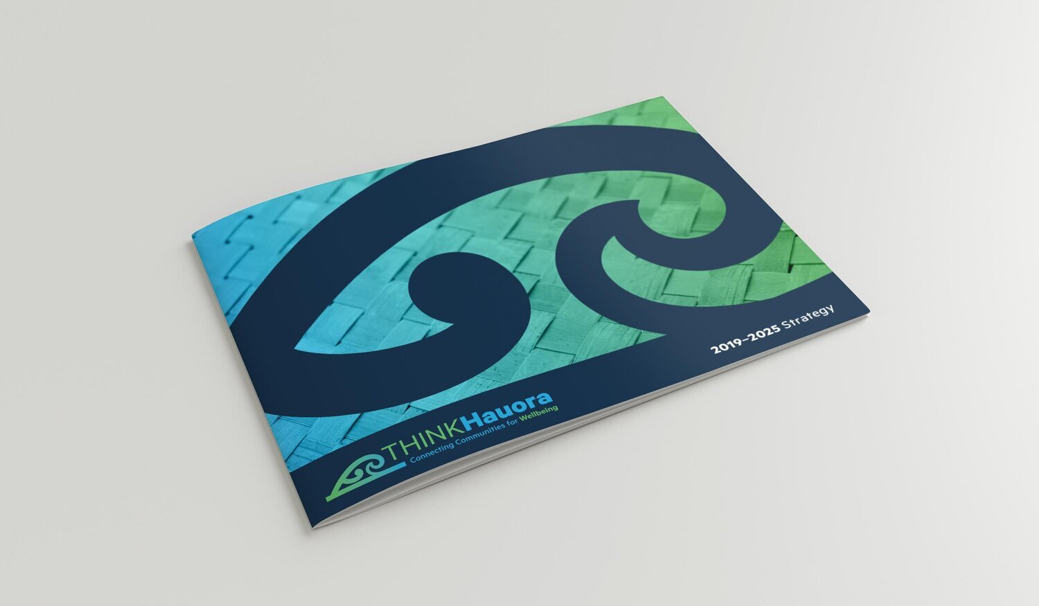
THINK Hauora rebrand
Working with the team at Central PHO, we developed and are steadily integrating a rebrand as THINK Hauora. The logo was completed in 2019.
The logo was created in partnership with Desiree Paul, who was the designer of the original logo and created the initial drawing for their new tohu. Their insights into the organisation’s history and future were invaluable in guiding the outcomes we’ve been able to achieve with this piece of work.
The 2019-2025 strategy was created in parallel to the rebrand, providing a comprehensive and aspirational document for everyone to hold onto as they move together.
Logo before

Logo after


The tohu draws inspiration from the prow of a waka drawing all people forward into a shared future. It speaks to equity. Awa, the river, is the system that connects people to land and people through time. It gives access to health-giving nourishment and ensures growth. The koru evokes imagery of our landscape: mountains, hills, plains, rivers, and a wave surge. The clean treatment speaks to new technology and an understanding of excellence in delivery.
‘THINK Hauora’ links technology, health, innovation, networks and knowledge to the wellbeing of all. It calls to partnership and inclusion. ‘THINK’ is an acronym. ‘Hauora’ means health, wellness and wellbeing. Hau: Wind, air (to be alive we need oxygen), vital essence, the vitality of a person, place or object. Ora: Alive, well (to be well we need the energy of the sun).
Tohu concept: Desiree Paul
Name concept: Nancy Taneja